The Psychology of Color in Marketing and Branding
To alleviate this trend and give proper treatment to a truly fascinating element of human behavior, today we’re going to cover a selection of the most reliable research on color theory and persuasion.
Misconceptions around the Psychology of Color
Why does color psychology invoke so much conversation … but is backed with so little factual data?
As research shows, it’s likely because elements such as personal preference, experiences, upbringing, cultural differences, context, etc., often muddy the effect individual colors have on us. So the idea that colors such as yellow or purple are able to invoke some sort of hyper-specific emotion is about as accurate as your standard Tarot card reading.
Related: How to Use the Psychology of Color to Increase Website Conversions
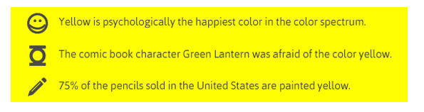
The conversation is only worsened by incredibly vapid visuals that sum up color psychology with awesome “facts” such as this one:
Don’t fret, though. Now it’s time to take a look at some research-backed insights on how color plays a role in persuasion.
The Importance of Colors in Branding
First, let’s address branding, which is one of the most important issues relating to color perception and the area where many articles on this subject run into problems.
There have been numerous attempts to classify consumer responses to different individual colors:
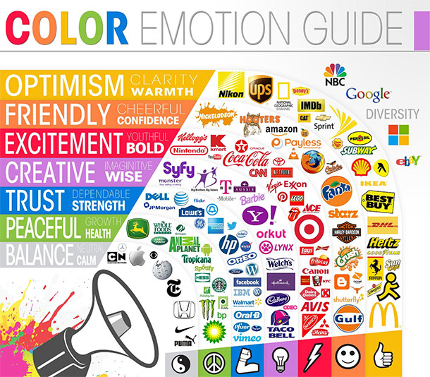
… but the truth of the matter is that color is too dependent on personal experiences to be universally translated to specific feelings.
But there are broader messaging patterns to be found in color perceptions. For instance, colors play a fairly substantial role in purchases and branding.
In an appropriately titled study called Impact of Color in Marketing, researchers found that up to 90% of snap judgments made about products can be based on color alone (depending on the product).
And in regards to the role that color plays in branding, results from studies such as The Interactive Effects of Colors show that the relationship between brands and color hinges on the perceived appropriateness of the color being used for the particular brand (in other words, does the color “fit” what is being sold).
The study Exciting Red and Competent Blue also confirms that purchasing intent is greatly affected by colors due to the impact they have on how a brand is perceived. This means that colors influence how consumers view the “personality” of the brand in question (after all,
who would want to buy a Harley Davidson motorcycle if they didn’t get the feeling that Harleys were rugged and cool?).
Additional studies have revealed that our brains prefer recognizable brands, which makes color incredibly important when creating a brand identity. It has even been suggested in Color Research & Applicationthat it is of paramount importance for new brands to specifically target logo colors that ensure differentiation from entrenched competitors (if
the competition all uses blue, you’ll stand out by using purple).
Related: When It Comes to Branding, It’s All About Color (Infographic)
When it comes to picking the “right” color, research has found that predicting consumer reaction to color appropriateness in relation to the product is far more important than the individual color itself. So, if Harley owners buy the product in order to feel rugged, you could assume that the pink + glitter edition wouldn’t sell all that well.
Psychologist and Stanford professor Jennifer Aaker has conducted studies on this very topic via research on Dimensions of Brand Personality, and her studies have found five core dimensions that play a role in a brand’s personality:
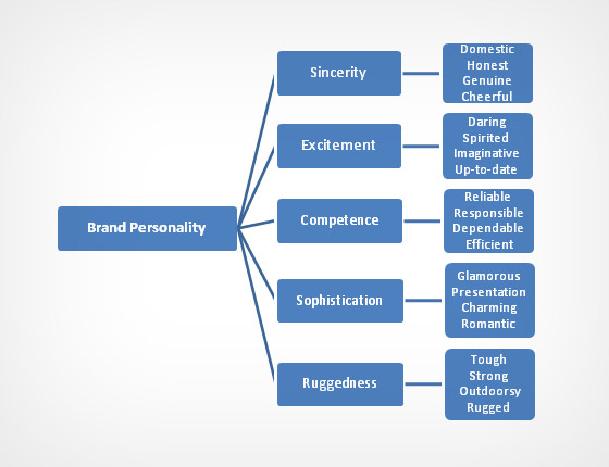
(Brands can sometimes cross between two traits, but they are mostly dominated by one. High fashion clothing feels sophisticated, camping gear feels rugged.)
Additional research has shown that there is a real connection between the use of colors and customers’ perceptions of a brand’s personality.
Certain colors DO broadly align with specific traits (e.g., brown with ruggedness, purple with sophistication, and red with excitement). But nearly every academic study on colors and branding will tell you that it’s far more important for your brand’s colors to support the personality you want to portray instead of trying to align with stereotypical color associations.
Consider the inaccuracy of making broad statements such as “green means calm.” The context is missing; sometimes green is used to brand environmental issues such as Timberland’s G.R.E.E.N standard, but other times it’s meant to brand financial spaces such as Mint.com.
And while brown may be useful for a rugged appeal (think Saddleback Leather), when positioned in another context brown can be used to create a warm, inviting feeling (Thanksgiving) or to stir your appetite (every chocolate commercial you’ve ever seen).
It’s the feeling, mood, and image that your brand creates that play a role in persuasion. Be sure to recognize that colors only come into play when they can be used to match a brand’s desired personality (i.e., the use of white to communicate Apple’s love of clean, simple design).
To read the full article click here.