If you’re a part of the Gen-X generation, chances are that you’re familiar with the minimalistic wavy NASA logo from the 1970’s. After retiring the logo in 1992, about 17 years after its inception, the logo has resurfaced onto a SpaceX Falcon 9 that is scheduled to launch in May. The logo has never been very popular internally, however, and was slapped with the derogatory nickname, the “worm.”
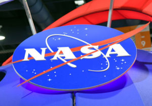
NASA’s official logo, however, remains the logo nicknamed “the meatball”. This round logo portraying a planet, stars, and an orbital path was created a year after NASA’s inception and was replaced by the worm from 1975 until 1992. While the meatball design has a more literal reference to space and flight, it was replaced by the worm by Richard Nixon’s administration as a larger overhaul of federal agency graphics. The reason for its replacement may have suggested a political agenda, as the Nixon administration wanted to change NASA’s mission into a more generalized problem-solving agency, not a space agency. This flexibility meant that NASA could be anything the government wanted them to be, and opened up more opportunity.
When the worm was retired in 1992 and replaced by the meatball once again, it was thought that the resurrection of the classic logo from the moon landings would help boost morale of the workforce, as that was during the time of several NASA failures.
These two logos have fought for NASA’s spotlight since the organization’s inception, and have caused massive controversy as people either loved or hated the worm. It will never truly disappear, however, as the worm is in the NASA headquarters building, carved into granite. Let us know which logo you prefer!


