Project Description

TRES AGAVES
MIXER LABEL CONCEPTS
DESIGN | PRINT | CONCEPTUAL
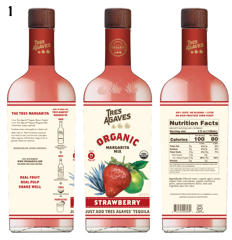
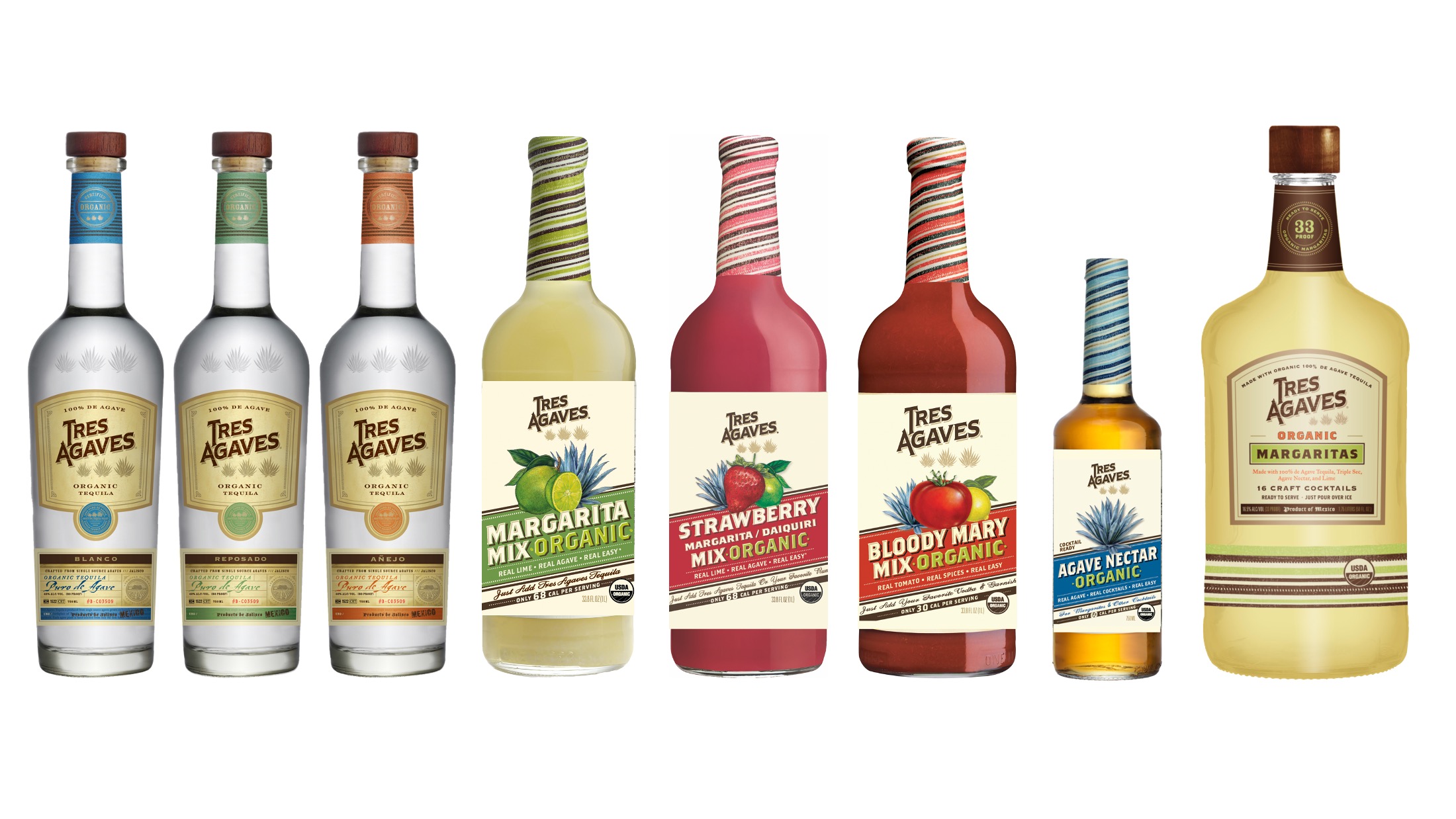
With a new year came a new vision for the Tres Agaves brand. Since the FDA updated the guidelines for nutritional facts, Tres Agaves was looking at updating their entire brand look. They wanted to take a look at how the new guidelines might shape the labels and more importantly, creating consistency across their product labels. We always welcome the opportunity to venture into the print dimension and enjoyed exploring this project with them.
First we started out by making some initial change requests from them before showing them what we thought might work.
Our initial ideas were to minimize the use of brown and emphasize the flavor colors to lighten everything up and create consistency with the word “Organic” by making it the same color across all mixer labels.
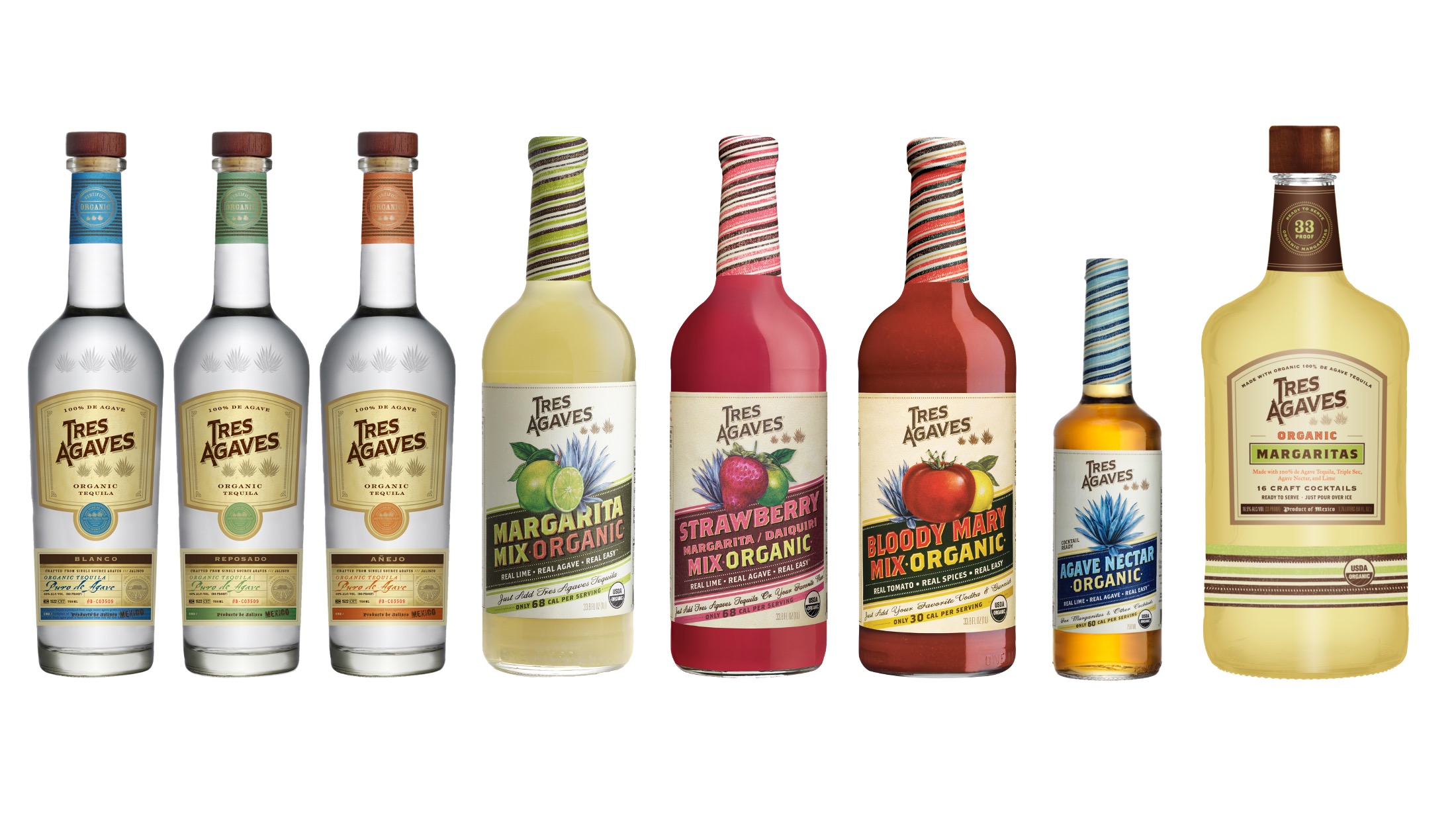
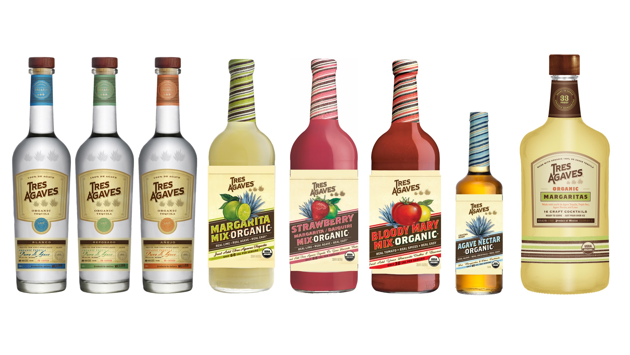
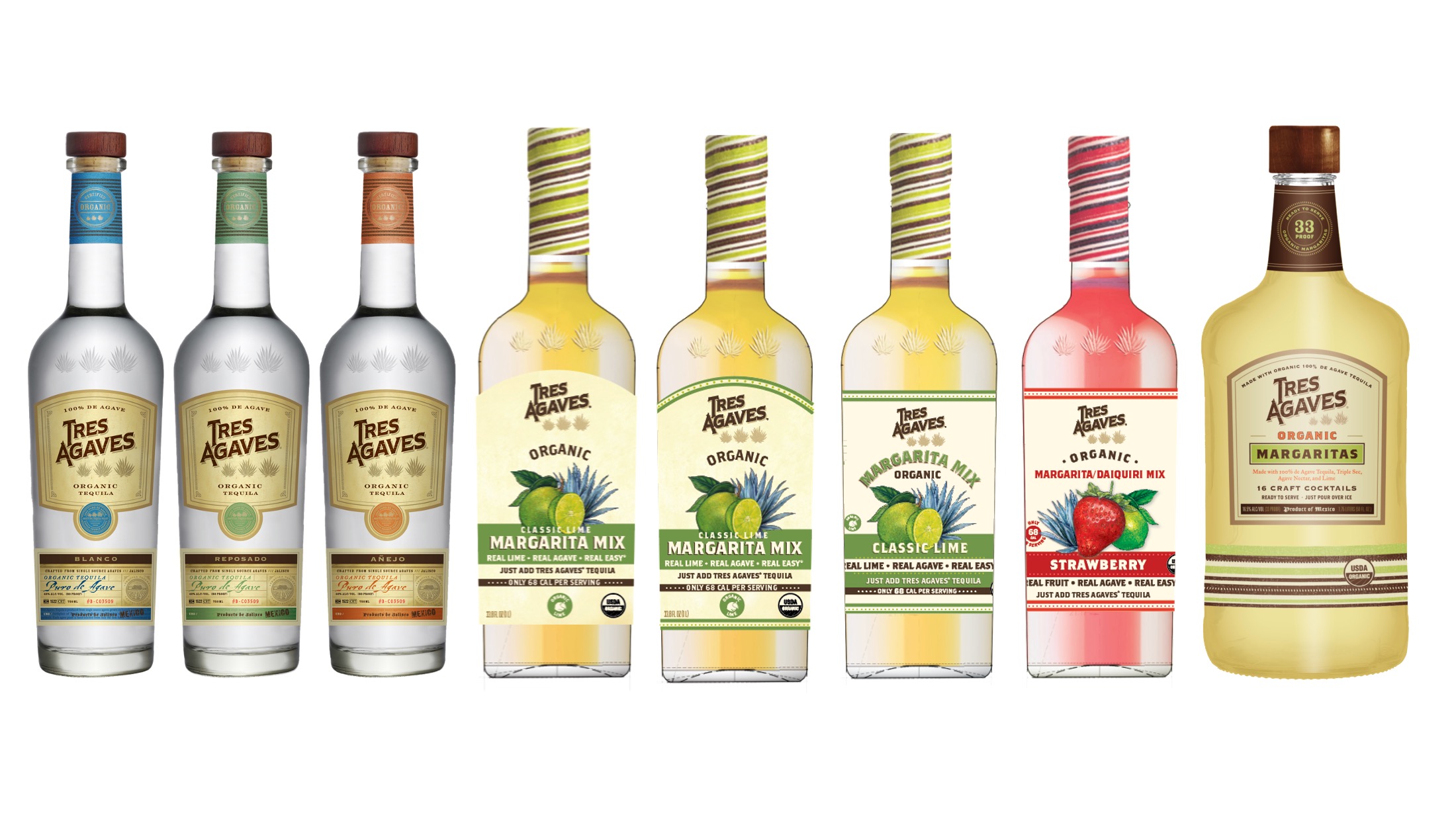
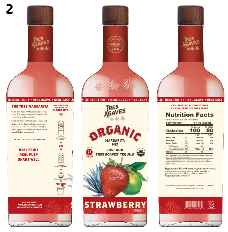
After the initial round of concepts, they wanted to see a mix of two labels– the arching product title of one and the bottom half with a large color block from another.


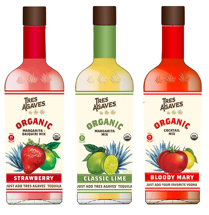
A visual for Tres Agaves to show how the new label concept would look in a row on a shelf at a store.
They wanted to bring more attention to the fact that their mixers are 100% USDA Certified Organic, so we swapped out the product title for the word Organic.

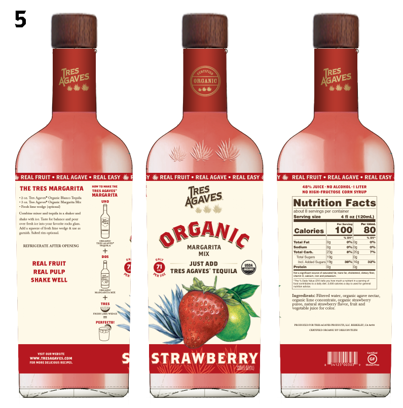
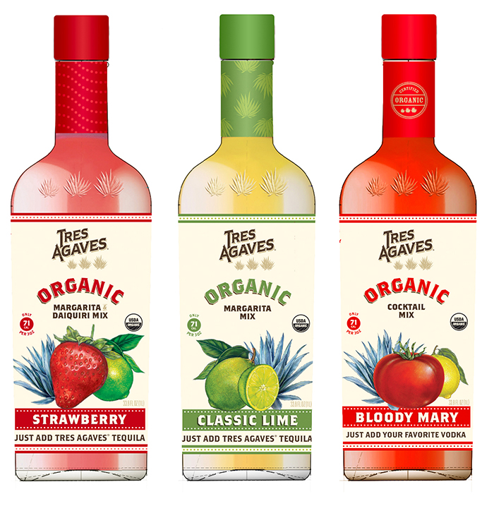
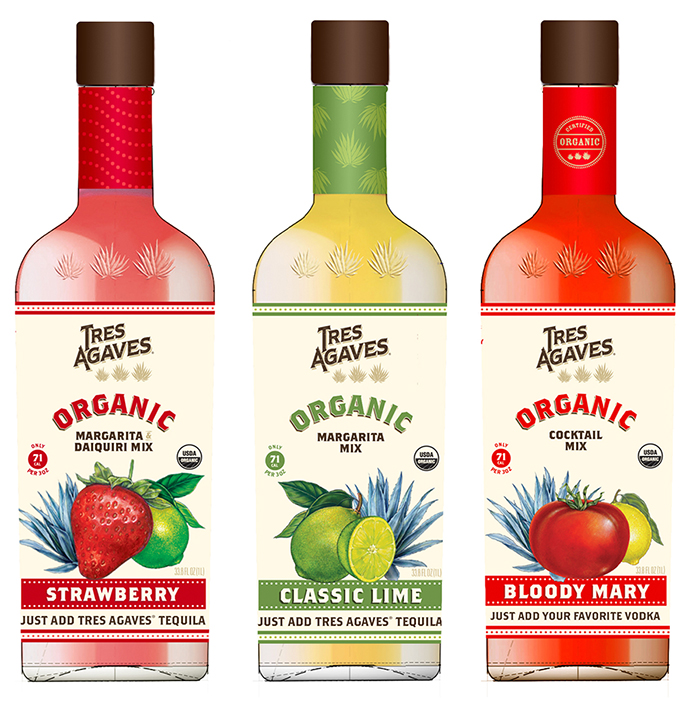
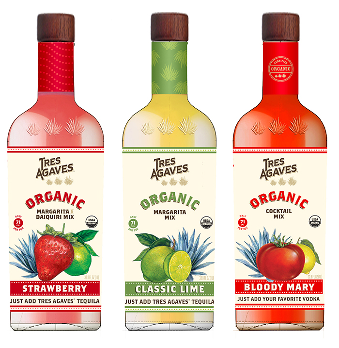
Now that the labels were updated, they want to explore new options for the bottle neck wrappers and caps. We provided them with some visuals of new wrapper designs and cap colors. Since the label had overall been simplified, we wanted to keep the wrapper pretty simple as well.

Finally, they asked for some designs that were totally different than anything they had seen before. They said not to hold back and to just have some fun. Our first thought was to make the fruit larger to be more attention-grabbing and to create a bold sense of flavor. In option three, we wanted to create a sense of dimension by overlapping some agave plants with a red bar at the bottom of the label.