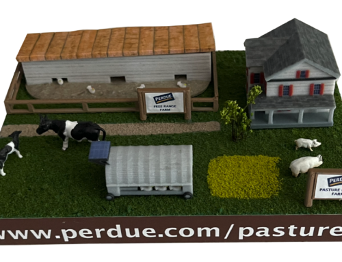
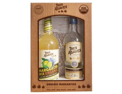
Project Description

TRES AGAVES
ORGANIC BOTTLE NECKERS
DESIGN / PRINT
Tres Agaves has always prided itself in its USDA Certified Organic mixers — it’s one of the things that sets them apart from everyone else. So it only made sense for them to come full circle and create certified organic tequilas as well. We were excited they chose us to help them show off their new achievement. Through weeks of design, revisions, press checks, string choices, and shipping, we ended up with a product we are all proud of.
PROCESS
They wanted to call attention to their new achievement in a noticeable, yet classy way. We showed them a variety of options for bottle neckers we thought would catch people’s eyes and minds. Though we considered a seed paper bottle necker, ultimately we chose a nice uncoated paper stock. We worked closely with our printer to find a paper stock which would closely match the tequila labels while still giving us the ability to print vibrant colors. We decided to go with offset plate printing because of the volume of neckers we needed and in order to get the crisp, vibrant colors that process produces. The final choice to make was which string to use. Originally we wanted to go with an elastic string to make fulfillment easier, but the jute string was a better choice for the look of the brand. We made sure to cut and tie our own strings at the office to make sure we got the length perfect so it wouldn’t cover up the brand’s logo when the final product was placed on the bottle. But our work didn’t end there. On our backend we worked to get the neckers die-cut, hole punched, strung, and shipped to the distillery in Mexico for placement on the bottles for both the new Tres Agaves Organic Reposado Tequila and Tres Agaves Organic Blanco Tequila.
DESIGN
Tres Agaves had already had a seal created for their bottle neck wrap which called out its new organic recipe. This seal served as the inspiration for the necker design. We didn’t want to stray too far from the design already established, and we didn’t want to introduce any new fonts for the sake of simplicity. In order to achieve the final design, our designer deconstructed the original seal and re-laid the elements out on the necker template. The new changes included reversing out the “ORGANIC” lettering, adding borders, and creating the pattern in the border. The outer border gives it a nice, finished touch. We stuck with the brand’s Pantone colors for all the main elements in order to keep brand consistency and brand recognition. As a final touch, we chose a metallic gold ink for the word “CERTIFIED” and the agave plants and added a spot UV coating on top to make them pop even more. The back of the neckers has the USDA Organic seal and the brand’s logo.