Lyndsie Oreno
Project Coordinator & Administrative Assistant
I started my career in the creative industry in 2008 at a small, local photography studio in my hometown. In 2009 I attended the Art Institute of Boston, now Lesley College of Art and Design, where I intended on majoring with a B.A. in Photography. I transferred to Framingham State University in 2012 and graduated in May 2014 with a B.A. in Communications.
I moved to Utah in August of 2018 and promptly began working here at Theory Brand Agency. I got to use all my skills I’ve acquired through the years — from photographing new products and samples to designing logos and artwork for custom promotional pieces.
Soft Skills
Detail oriented
Team player
Problem solver
Productive
Independent
Creative
Hard Skills
Graphic design
Photography
Layout
Typography
Web design
Vector illustration / icon design
Photo manipulation / photo editing
Adobe Creative Suite
- Adobe Photoshop
- Adobe Illustrator
- Adobe InDesign
- Adobe Lightroom
WordPress
Shopify
Microsoft Office Suite
- Microsoft PowerPoint
- Microsoft Word
- Microsoft Excel
Recognition
Designed insert for nation-wide launch of a new product line for a premium chicken brand
Designed all the elements for a national tequila campaign
Strengths
Fairness
Curiosity
Humility
Love
Love of Learning
*Based on the VA Institute of Character
FEATURED DESIGN PROJECTS

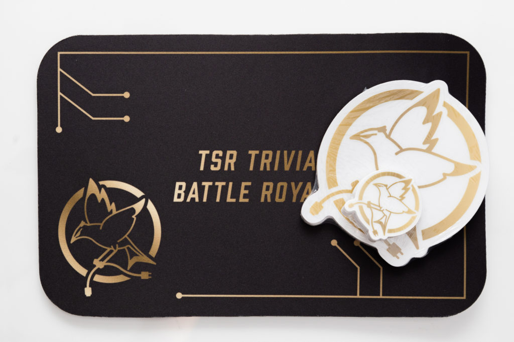
MARVELL TRIVIA BATTLE ROYALE
To boost morale and camaraderie, Marvell decided to create a trivia game between their partners. They wanted to create an entire theme around their trivia battle royale, so I designed this emblem which I used in a variety of designs including:
- Email marketing
- PowerPoint templates
- Competition bracket
- Stickers
- Mousepads
- Physical award
It was a fun challenge to hone my illustration skills and to create a gold color scheme that would work well on screen and in print, since we only had the option to use four color process.
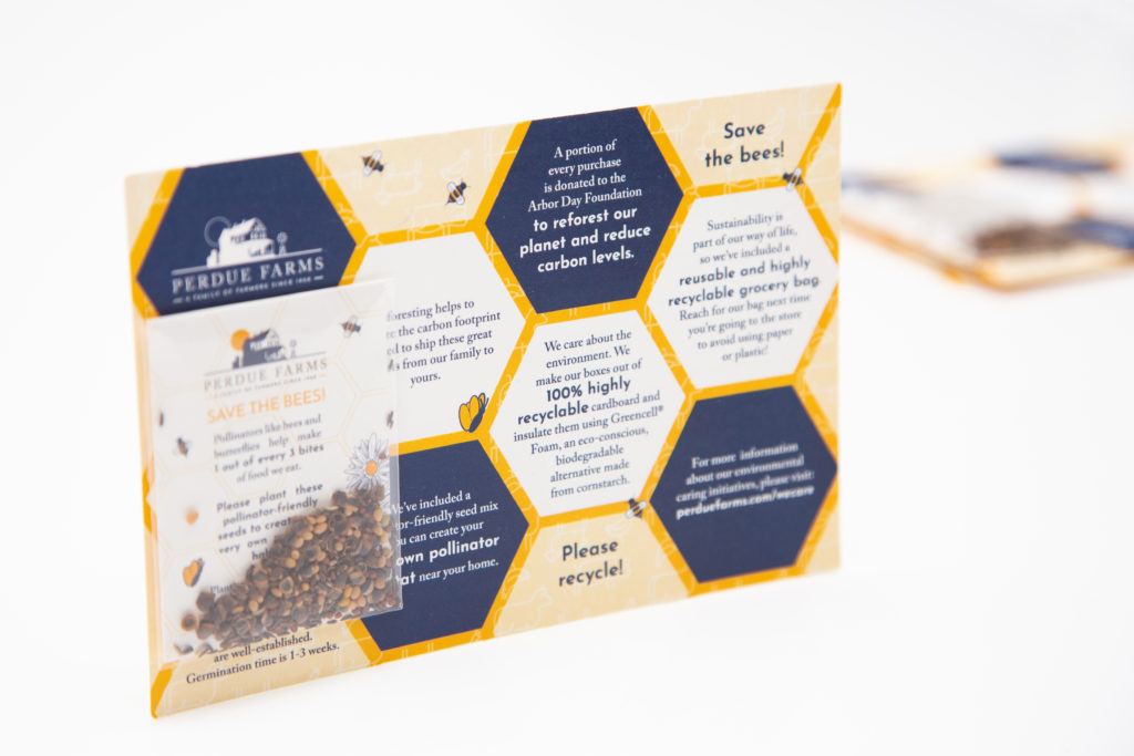
PERDUE FARMS SEED CARD
I designed an insert card for Perdue Farms which went with the launch of their new direct-to-consumer ordering service. They wanted to bring some light to the worldwide bee crisis by offering a special wildflower mix. I ran with that idea to create a hexagon pattern which house the talking points they wanted to include. In the background is their brand yellow. I decided to include a transparent pattern overlay of their animal icons in order to break it up a bit since yellow is such a strong color.
It was a fun experience to design something for a brand that I grew up with back on the East Coast!

