Yahoo Finance
By Daniel Roberts
May 12, 2016 1:30 PM
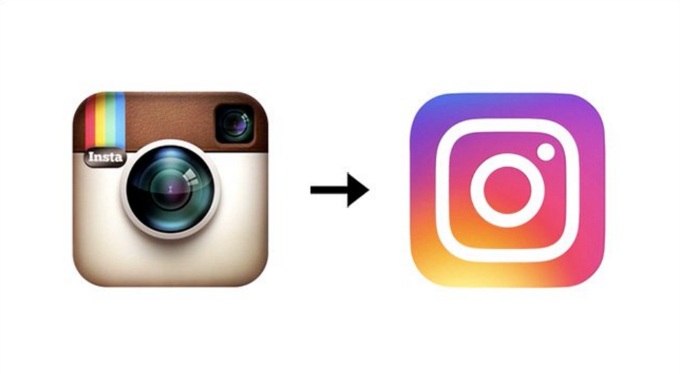
Did you notice? Instagram changed its logo this week.
Of course, Instagram isn’t the first tech company to change its logo recently, and to roll out a whole song-and-dance promotional campaign around why it did so and what it means. In fact, Instagram’s logo saga completes a trifecta of Silicon Valley “unicorn” startups doing the same, and meeting with similar ridicule. And before those recent three, others did the same.
Instagram isn’t about to lose its 400 million users over a new logo. And usually, a ridiculed logo doesn’t materially damage the business. (Tropicana, which spent $35 million on its rebranding and then saw sales plunge 20% as a result, is a memorable exception.) Users of a product, app or web site always hate change at first. In almost all cases, the negative response to a new logo soon blows over and people move on. But let’s dredge some of them back up.
UBER
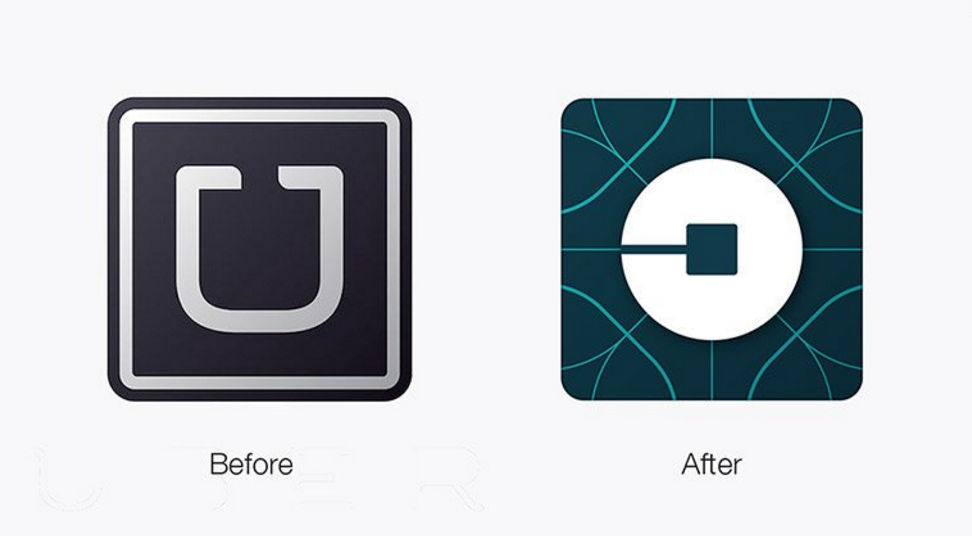
Uber launched a big brand overhaul this year, with special symbols for every country, and a puffyWired Magazine profile that told “the inside story of Uber’s radical rebranding.” Radical or not, the logo was widely ridiculed. Many compared it to a toilet, or said it looks just like the JPMorgan Chase symbol. The Huffington Post asked, “Are they kidding?” Inc. wrote that the rebranding “reveals everything that’s wrong with Uber.” Three months later, the noise has mostly died down.
Airbnb
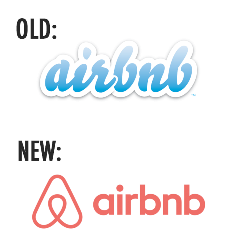
Airbnb rolled out a new logo in 2014 to widespread ridicule. The company called it “the Bélo,” a “symbol of belonging.” People said it looked like private parts, or a person squatting, or a paperclip. And there were more serious accusations: it closely resembled the logos of other companies in the same general industry, like Sweethome and Couchsurfing. Eventually, people accepted it.
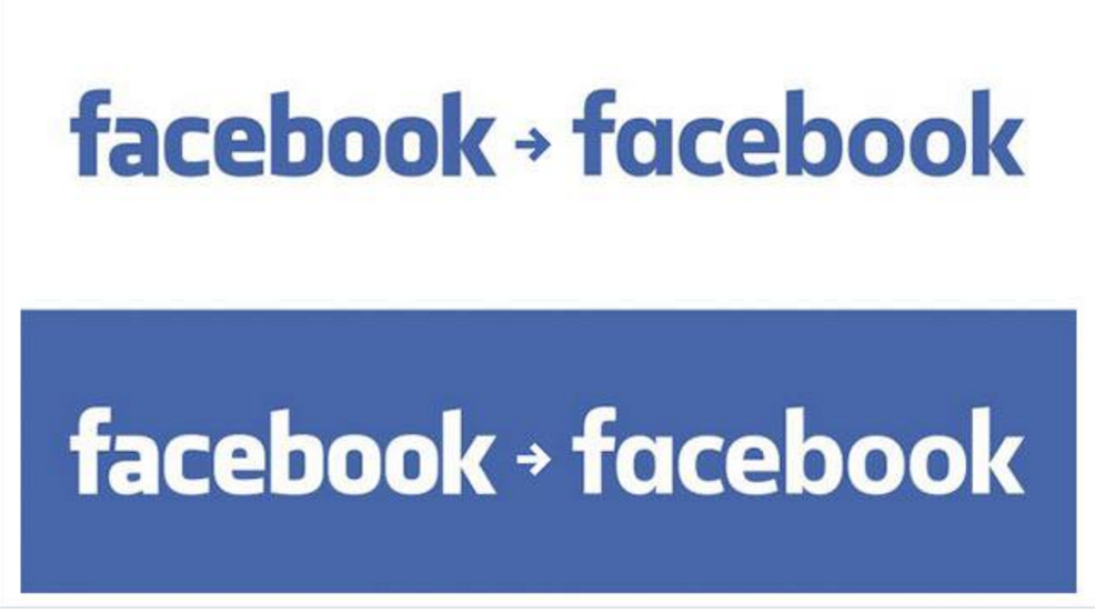
Last summer, Facebook (FB) changed the lettering of its wordmark, but as countless news sources shouted in their headlines, “you probably didn’t notice.” All that changed was the typeface: the letters got a little slimmer. Facebook said it made the mark more mobile-friendly, but for once, this was a case of people derided a logo change not because they hated it, but because they didn’t understand the point of it.
Verizon and Gap
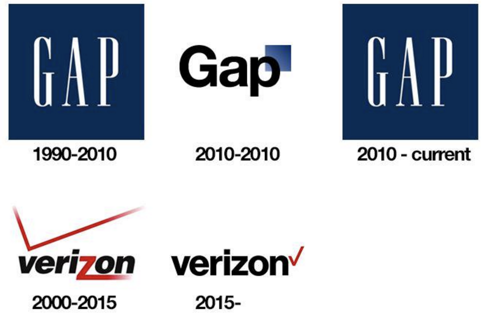
Verizon (VZ) changed its logo last year, and most people felt it was for the worse. The previous logo had a long, extended line that doubled both as a V and what looked like a cell-service indicator. It also had a dynamic tail on the z. The new logo shrinks the red v down to what looks like a check mark. As a branding blog wrote at the time, “Last year, logo design went flat. This year, designers are going much further than killing gradients and shadows, they’re killing everything.” Ouch.
Gap
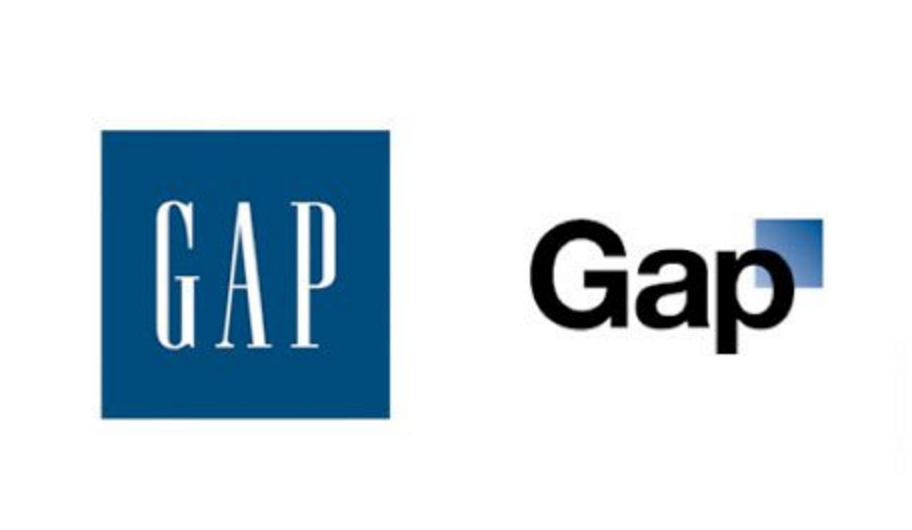
And so we arrive at the granddaddy of all logo change disasters: Gap. In 2010, The Gap (GPS) changed its logo so completely that the backlash was overwhelming. Customers detested the new logo, and in under a week, Gap reverted back to the old logo with a sheepish apology post: “We’ve heard loud and clear that you don’t like the new logo. We’ve learned a lot… We’re bringing back the Blue Box tonight.”
If any avid Instagram user out there so hates the new logo that they’d like to see it revert to the old, hey, start a petition—it just might work.