Adding color to your custom packaging can be a great way to make your brand stand out, but it also presents challenges. When the design mantra is to keep it simple, how do you incorporate color? Is it OK to have more than one color? How about adding a lot of different colors? Is there a way to make sure the colors work together to highlight your brand and message and not distract from it?

The simple answer is to go with a monochromatic color palette. Going monochromatic doesn’t mean sticking with a single color, as the name seems to imply. Instead, it means choosing one base color and then using variations of that color in your design.
To choose your base color, you might look to your company, brand, or event’s established color to start. From there, think about the mood you want to create or the feelings about your product you want to evoke as you tweak your palette.
If you’re creating your custom packaging based on a single product or themed, use the product or launch theme as a jumping off point for your color. If you’re selling tennis balls, for instance, yellow might be a good base color and you’ll want to keep the colors light and bright. Or, if you’re creating packaging around winter, then you might choose green but go for deeper shades to mimic conifers. Perhaps your product is meant to evoke calm and stillness, in which case blue could be your color.
No matter what base color you choose, using a monochromatic color palette as your creative border allows you a great deal of freedom in your overall custom package design. Here are a few examples of real-world companies that used a monochromatic color scheme in their packaging to great effect.

In this redesign for Tesco Tea’s Infusion line, London-based R Design used a monochromatic color scheme to highlight each individual tea flavor (a muted green for peppermint, orange for lemon-ginger, blue for chamomile, and brighter green for apple-cinnamon) and draw attention to the eye-catching botanic-inspired illustrations.
The design team behind the Izze family of beverages’ look, Vermillion, took a brighter approach (photo at top) with its use of monochromatic palettes for each of its flavors. Using inspiration from the flavors themselves to lead the packaging colors, Vermillion made a palette for the bottles and boxes that reflected what’s inside. The resulting packaging catches the eye and clearly demonstrates the bright, fresh flavors within.
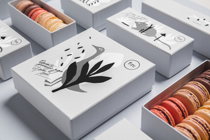
On a more muted note, the Serbian design firm Metaklinika created a grey palette for a local patisserie, Fini. The forest scene on each box is meant to evoke vintage 20th-century picture books, but our favorite part of the design is the contrast between the bright macaroons inside and the grey box that contains them. That contrast of what’s on the outside of your box vs. what’s on the inside can be fun to play with too.
To design your custom box, go to DistinctPackaging.com where everything from corrugated shipping boxes to folding cartons and beverage carriers can be customized for your business or event.